
· 3 min read
Sangwon Jin

The need for more skilled developers is becoming a growing problem in the IT industry. One of the main reasons for this problem is the rapid expansion of the technology sector and the ever-increasing need for software development across industries. Recent studies show that demand for developers exceeds supply, leading to hiring challenges, longer development times, and higher costs.

collaboration

Communication and collaboration issues are also significant concerns for software development teams. As software development projects increase in complexity, team members must work closely to ensure that the final product meets the end user’s needs. However, remote working, time zone differences, and development language barriers can hinder communication and collaboration among all team members.

Software development challenges in 2023 are expected to include increased security threats, the need to integrate multiple solutions, and more significant pressure to deliver software products rapidly. These challenges require skilled developers working efficiently and effectively with various technologies and tools.

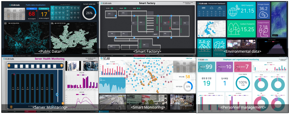
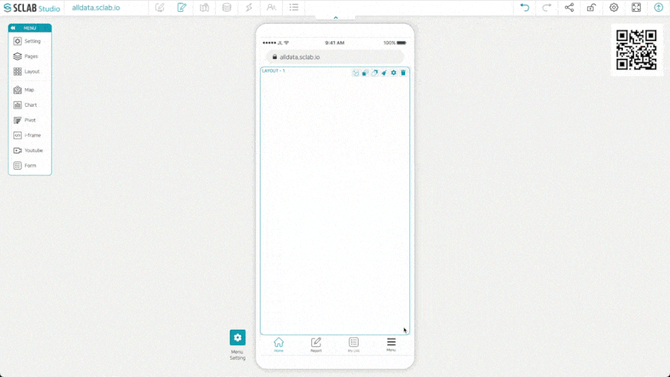
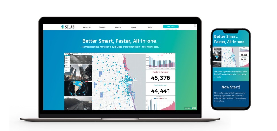
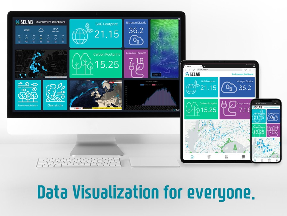
SCLAB Studio can help address some of these challenges by providing a no-code platform for data visualization that allows non-technical team members to collaborate effectively with developers. SCLAB Studio makes it quick and easy to create data visualizations without extensive coding expertise. This frees developers to focus on more complex software development tasks and allows them to create data visualizations and dashboards to support decision-making.

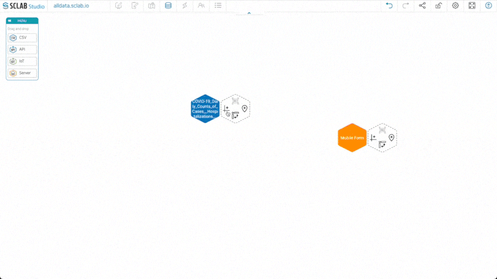
SCLAB Studio also provides collaboration features that allow team members to work more effectively together regardless of location. Users can share screens, chat, and comment on projects in real-time, reducing communication and collaboration barriers. SCLAB Studio also provides integration with various data sources, including CSV, IoT, API, GIS, and several DB interfaces, making it easier to integrate data into software development projects.

SCLAB Studio addresses the developer shortage in a variety of industries.

Data Visualization SCLAB

Company X is a young company with limited resources and needs help to hire a full-time development team. As a result, although software development was outsourced to various overseas companies, the quality of work was relatively high. Communication and collaboration were difficult due to time differences and language barriers.

Solution: Company X can use SCLAB Studio to visualize data without a dedicated development team. SCLAB Studio’s intuitive drag-and-drop interface allows non-technical staff to quickly create visualizations, reducing the need for outsourcing and improving communication and collaboration within the company.

Company Y is a company struggling with digital transformation. Companies need to gain experience and expertise in digital transformation.

Solution: Company Y uses SCLAB Studio to streamline the digital transformation process of data and expedite the work of managers within the company. SCLAB Studio’s no-code approach allows non-technical staff to create data visualizations, freeing them to focus on complex software development tasks for digital transformation.

Company Z is a government agency with a limited software development budget. The agency’s low salaries compared to the private sector made finding and retaining qualified developers easier.

Solution: Company Z can use SCLAB Studio to visualize data without hiring additional developers. SCLAB Studio’s intuitive interface allows non-technical staff to create visualizations, reducing reliance on expensive software and saving money in the long run.

In summary, the need for more skilled developers and communication and collaboration challenges remain significant issues for software development teams. However, software development teams can overcome challenges by leveraging a no-code data visualization platform like SCLAB Studio. This allows them to work together more efficiently and effectively to deliver high-quality software products.

· 3 min read
Sangwon Jin

Data visualization is essential for industries that require data analysis, decision-making, and stakeholder communication, and successful digital transformation can be achieved in various data visualization industries.

SCLAB Studio

Government and Public Agencies: Data visualization is essential for public data to be accessible and understandable. We regularly monitor vast amounts of data, from census data to weather patterns, crime statistics, medical data, and more. With the city’s map data, and GIS (Geographic Information System), you can plan your city’s infrastructure through various spatial analyses. It also helps government agencies and policymakers make informed decisions and makes data easily accessible and understandable to the public. SCLAB Studio can help government managers or data-hungry service providers create interactive dashboards that make exploring public data and gaining insights quick.

Smart Factory: In a smart factory, data visualization can help improve efficiency, optimize operations and reduce costs. SCLAB Studio can help by creating real-time dashboards that monitor machine health, production data, and other vital metrics. This data can be visualized in charts, graphs, and gauges, making it easy to identify trends and patterns and take corrective action quickly.

Intelligent environmental monitoring: Environmental data is critical for intelligent environmental monitoring, providing real-time information on air and water quality, weather patterns, and other environmental factors. This information can be visualized in maps, charts, and graphs to understand environmental conditions better. SCLAB Studio can help create interactive dashboards displaying data from various sensors and IoT devices. SCLAB Studio can help create interactive dashboards displaying data from various sensors and IoT devices.

Server Health Monitoring: Server health monitoring is essential to ensure server uptime, detect anomalies and troubleshoot problems. SCLAB Studio can help by creating real-time dashboards that monitor server metrics such as CPU usage, memory usage, and network traffic. This data can be visualized in charts, graphs, and tables, so IT teams can easily monitor server health and performance.

Occupational safety monitoring: It is essential for occupational safety monitoring to ensure a safe working environment for employees. SCLAB Studio can help by creating real-time dashboards that monitor safety metrics such as temperature, humidity, air quality, and noise levels. This data can be visualized in charts, graphs, and maps so that safety issues can be easily identified and corrective action taken quickly.

Employee and organizational monitoring: It is essential for personal and organizational monitoring to improve a company’s workforce productivity and efficiency. SCLAB Studio can help by creating dashboards to monitor key performance indicators such as employee attendance, turnover, and productivity. This data can be visualized in charts, graphs, and tables so managers can monitor performance and make informed decisions.

Can improve. Educational institutions use data visualization to track student progress and identify learning trends and teaching outcomes. Beyond that, it can help marketing professionals track campaign performance, identify target audiences, and measure the impact of marketing efforts.

SCLAB Studio can be a tool in such a scenario, allowing governments and public agencies to easily create interactive data visualizations without extensive coding knowledge. It can also help these organizations collaborate and share data across departments and agencies to drive more effective decision-making and policy implementation.

· 2 min read
Sangwon Jin

Data visualization is a very effective tool to help you understand and analyze your data more efficiently. But just because you have data doesn’t mean you can blindly visualize it.

laptop

The data must be refined to some extent for data visualization. The data must be free from errors such as missing values or outliers. Otherwise, visualization results may convey misleading information.

In addition, specific knowledge and skills were required depending on the type of data visualization produced. For example, drawing a bar graph is relatively simple, but map visualization requires geographic information (GIS) and cartography skills.

Visualization cannot be done with only data. To visualize data, it is necessary to understand and analyze the data well before selecting and using appropriate visualization methods and tools. Therefore, understanding and analysis of data, as well as knowledge and skills for visualization, are all required to visualize data.

SCLAB Studio makes it easy for anyone to create data visualizations with no code.

Data Editor

SCLAB Studio is a user-friendly data visualization authoring tool that allows users to create data visualizations using a simple drag-and-drop interface easily. This tool allows users to create maps from GIS and location data and display them on Internet maps. Just like making a presentation with PowerPoint, users can create various charts and graphs using their data without knowing the code.

Page Editor

To use SCLAB Studio, users drag and drop various elements onto the layout to compose the screen. You can then apply charts and maps to your layout with a simple drag-and-drop. This makes the entire process of creating data visualizations quick and easy.

SCLAB Studio allows users to connect widgets and IP CCTVs using i-frames and insert YouTube videos. Users can easily add rich multimedia elements to data visualizations without knowing the code.

Mobile Editor

Finally, SCLAB Studio allows you to create data visualizations on mobile without any additional development. Users can easily create data visualizations through the mobile editor as simply as they create desktop visualizations. Overall, SCLAB Studio is a versatile and easy-to-use data visualization tool that helps businesses and individuals easily create visually appealing data displays.

· 2 min read
Sangwon Jin

Code

Data visualization has become an essential tool for decision-making in various industries. With the increasing volume of data available, it is more important than ever to understand and present data clearly and effectively. Here are seven reasons why data visualization is a must:

  1. Data is more accessible with visualization. One of the most significant benefits of data visualization is that it makes complex data more accessible to a broader audience. Charts, graphs, and other visual aids make it easier to understand data patterns and relationships, enabling people to quickly and easily identify trends and insights.

  2. Enhances data comprehension. Visualizing data helps people to comprehend better and interpret large volumes of data. People can more easily identify relationships, patterns, and trends by presenting data more engagingly and understandably. This can lead to faster and more effective decision-making.

  3. Helps to identify patterns and trends Data visualization tools enable users to identify patterns and trends in large data sets quickly. This can lead to better decision-making, allowing users to identify areas of opportunity or potential problems efficiently.

  4. Simplifies complex data. Data visualization tools make complex data more manageable and easier to understand. By presenting complex data in a simple and easy-to-understand format, users can more easily identify important insights and trends.

  5. Facilitates collaboration Visualization tools enable teams to collaborate more effectively by allowing them to view and analyze data together. This can help teams to identify and solve problems more quickly and to make better-informed decisions.

  6. Makes data more memorable. Visual aids are more memorable than text, making data more memorable when presented in a visual format. By presenting data in a way that is easy to understand and remember, people can more easily recall essential data points when needed.

  7. Provides a competitive advantage. Using data visualization tools, companies can gain a competitive advantage by identifying trends and patterns before their competitors. This can lead to more effective decision-making and better business outcomes.

In conclusion, data visualization is a must-have tool for decision-making in various industries. With the benefits of accessibility, comprehension, pattern identification, simplification, collaboration, memorability, and competitive advantage, data visualization is essential for anyone working with data. SCLAB Studio allows users to create data visualizations easily. SCLAB Studio is renowned for its user-friendly interface and intuitive design, allowing users to easily create custom visualizations and dashboards without coding skills.

· 2 min read
Sangwon Jin

ChatGPT

The introduction of artificial intelligence (AI) chatbots(ChatGPT) and no-code/low-code platforms has made it possible for anyone to create applications, regardless of their coding knowledge. The concept of drag and drop is becoming increasingly popular, making it easier for individuals to develop custom software applications.

Data visualization has been a critical tool for businesses, researchers, and individuals to understand, analyze and communicate data effectively. The increasing amount of data generated daily makes it challenging for organizations to analyze and make informed decisions effectively.


Empowering Data Visualization

Many data visualization authoring tools provide users with an easy-to-use drag-and-drop interface. But with SCLAB Studio, you can easily link data from various sources such as CSV, IoT, API, GIS, and multiple database interfaces and create custom visualizations. You no longer have to rely on expensive software or complex coding skills to create data visualizations.

The benefits of using no-code in data visualization are clear. It allows organizations of all sizes to create advanced visualizations and dashboards without needing specialized technical skills or hiring additional resources. This saves time and money while providing high-quality visualizations that help organizations make better decisions based on the latest insights.

SCLAB Studio also provides advanced analytics and data management tools that enable users to understand and interpret their data better. With these tools, you can quickly identify trends and patterns, discover new insights, and make informed decisions based on your data.


Data Visualization to the next level

In conclusion, SCLAB Studio is a powerful, no-code data visualization solution that allows organizations to easily create advanced visualizations and dashboards without the need for technical skills or hiring additional resources. With SCLAB Studio, businesses and individuals can unlock the power of data visualization to make informed decisions, identify trends, and uncover new insights.

So, are you ready to take your data visualization to the next level with SCLAB Studio? Try it today and see the difference it can make for your organization.

· 2 min read
Sangwon Jin

Companies must find better solutions for managing and visualizing their data to drive digital innovation and improve business productivity. Data continues to be generated every hour, and companies and institutions face challenges monitoring and managing this data. One of the biggest challenges is integrating data visualization and management effectively. Additionally, companies are becoming increasingly dependent on outsourcing data management due to the shortage of in-house data experts and the high cost of hiring and training these experts. This is leading to more extended construction periods and reduced business efficiency.


SCLAB Thumbnail

SCLAB Studio is a data visualization tool enabling you to create custom dashboards easily. It is ideal for organizations of all sizes and provides a comprehensive solution for improving collaboration and data analysis. Using a user-friendly, no-code interface, you can connect multiple data sources, including CSV, IoT, API, GIS, and more.


  1. Even for the same data, each person can freely set their data and an appropriate threshold to create the desired screen.

  2. Integrate other data sources to create accurate visualizations.

  3. An easy user interface allows you to navigate and use the platform effectively.

  4. In addition to data visualization, the visualization field can be expanded in many ways.

SCLAB Studio offers an innovative approach to data visualization that makes it easier for businesses and organizations to collaborate and create visualizations without coding. This approach can help save time and reduce the cost of building a data visualization solution. SCLAB Studio’s advanced visualization tools are applicable across various fields, including smart cities, safety, the environment, intelligent factories, transportation, public data, and energy. These tools help organizations make better decisions by providing them with the latest insights.


SCLAB Studio offers SaaS and on-premise solutions depending on the customer’s specific requirements. For instance, government agencies or enterprises with strict security and compliance standards may prefer an on-premise solution. At the same time, companies new to data visualization or with limited IT resources may choose the SaaS option for its ease of use and cost-effectiveness.

We will provide more information about SCLAB Studio in the future, so please stay tuned.

· One min read
SungYong Jang

Hello,

SCLAB Studio is an editor that allows you to visualize data without coding and a tool to create various dashboards without coding.

You can easily connect to various data sources such as CSV, API, IoT, Kafka, and Databases, and anyone can access the created dashboards as a web service.

In the future, we will introduce various articles such as news and guides about Scrap here.

Thank you.